Fetch brand refresh
Refreshing the digital brand experience to connect with younger customers.
Visual Design
Overview
A brand refresh was needed to modernize the pet insurance brand without losing its original appeal.
Challenge
Fetch's primary customer base is older (41-69 years) and high-income, but early churn reveals a different audience–one that is younger (18-34 years) and middle-income.
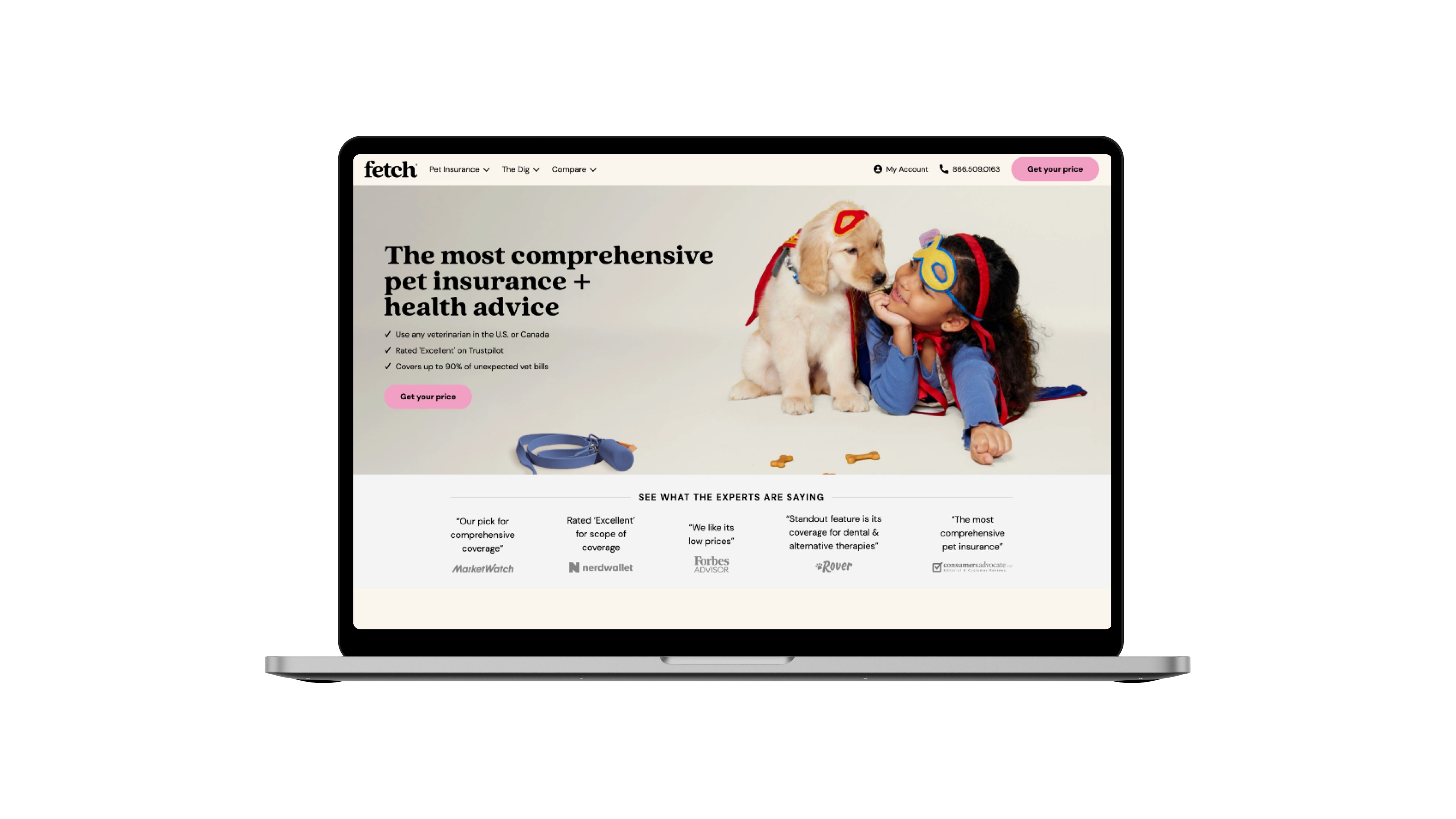
Based on this context, there was an opportunity to analyze how Fetch showed up amongst competitors and explore different directions based on existing brand foundations.
One constraint we had to face was keeping the original brand's typefaces, Quincy and DM Sans, in order to minimize the amount of company-wide brand changes.
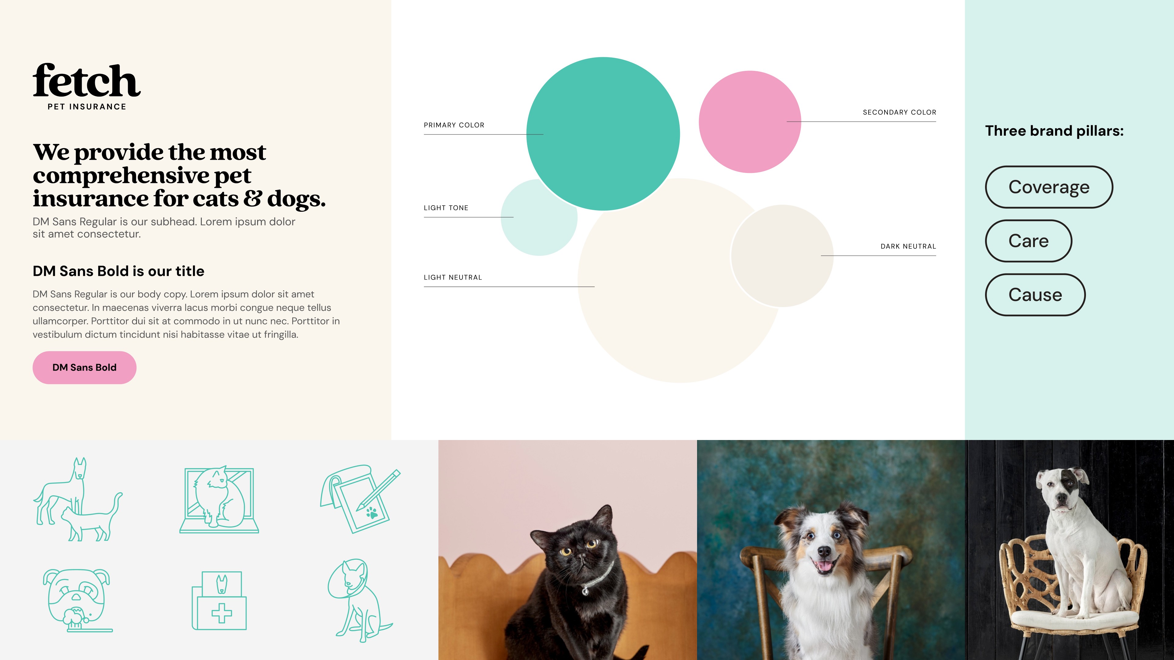
Role
The team used customer insights to guide brand strategy, focusing on the brand's mission: coverage, care, and cause. From these, we established three principles: simple, personal, and genuine. These helped direct us where we wanted to go.
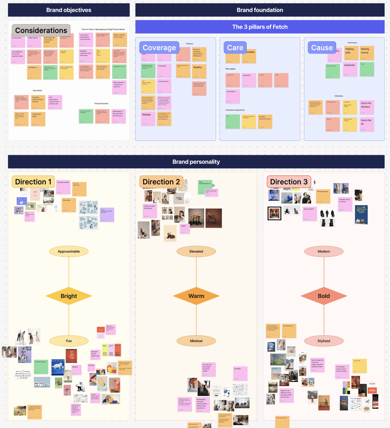
Solution
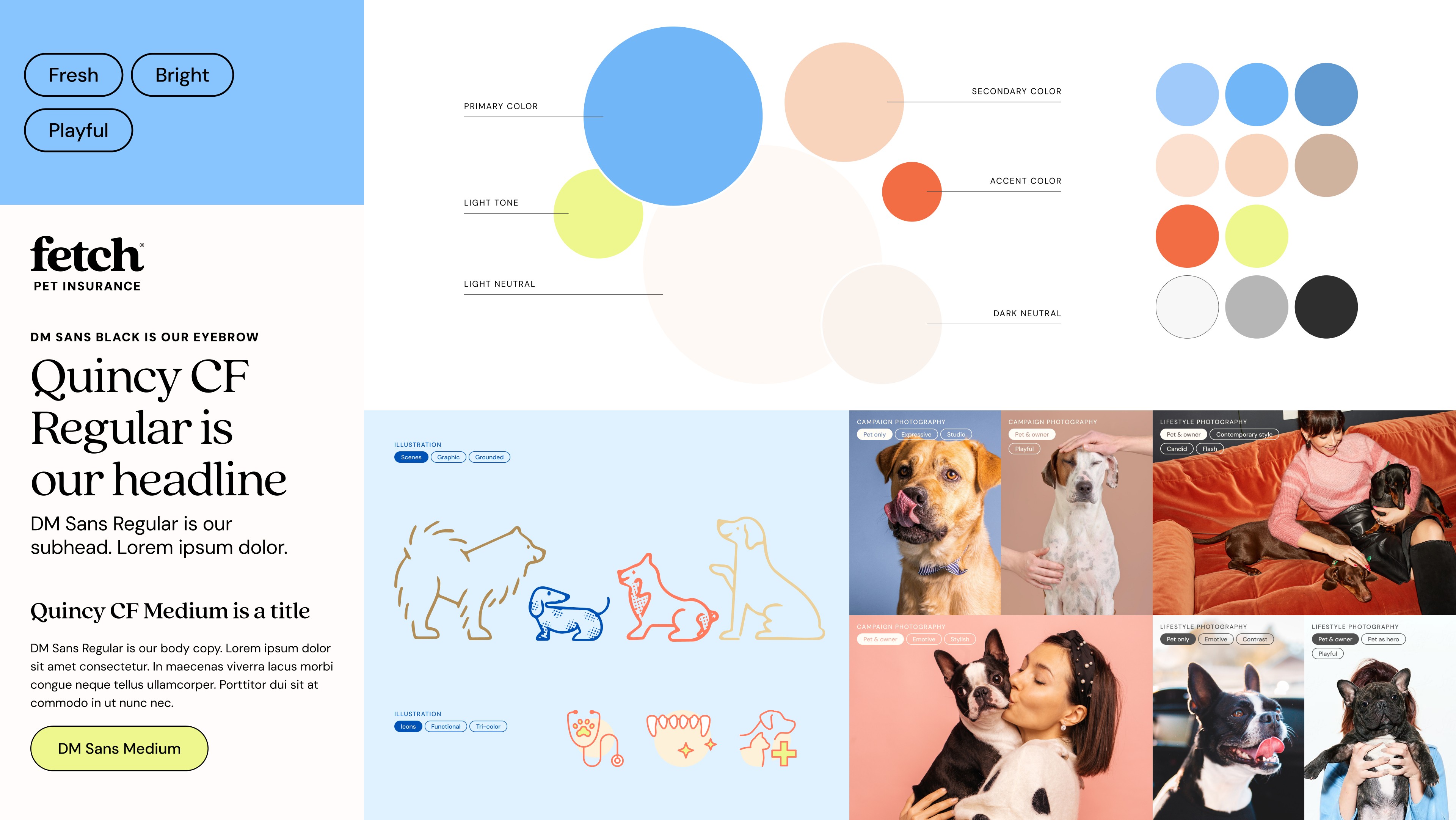
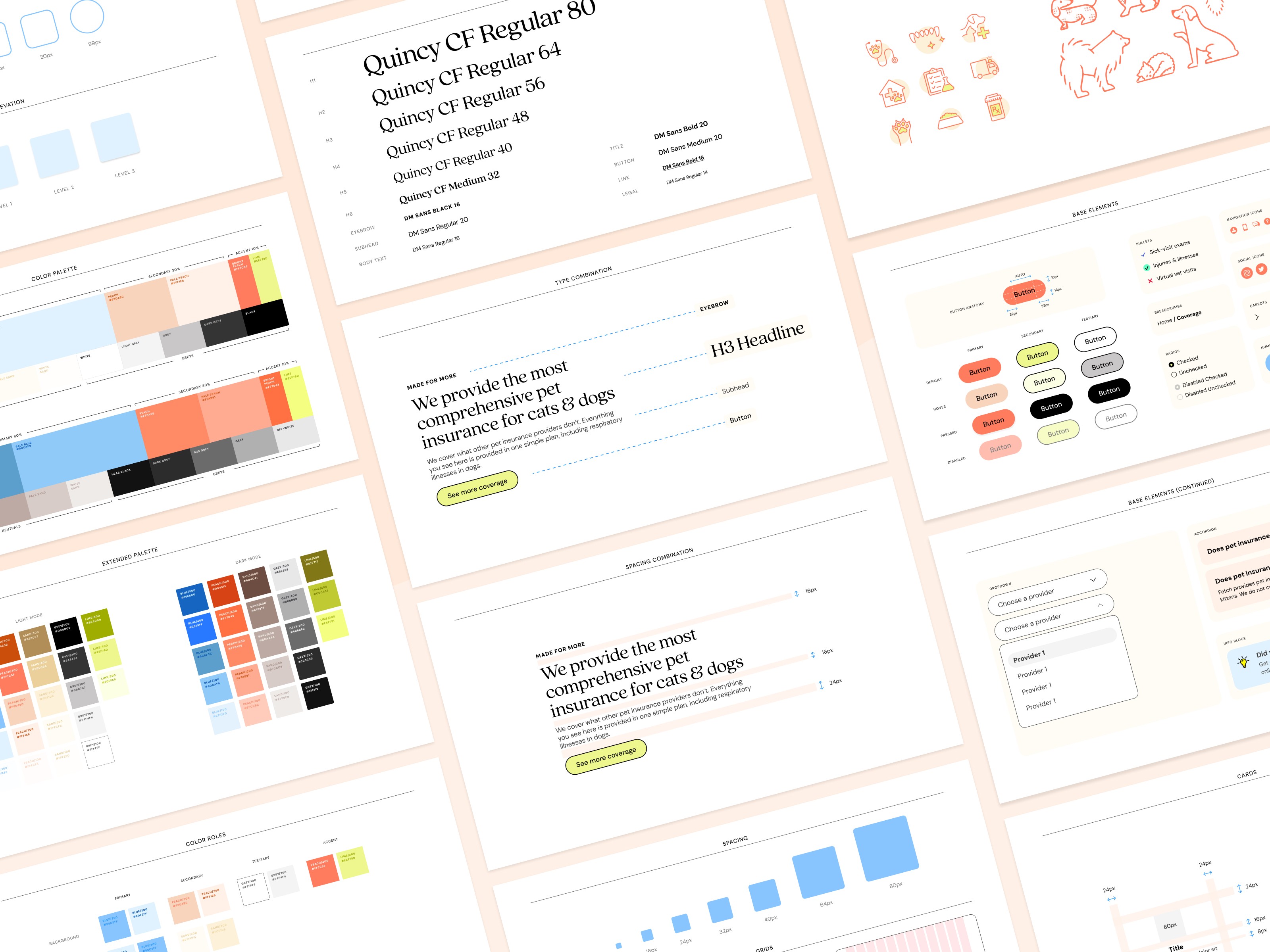
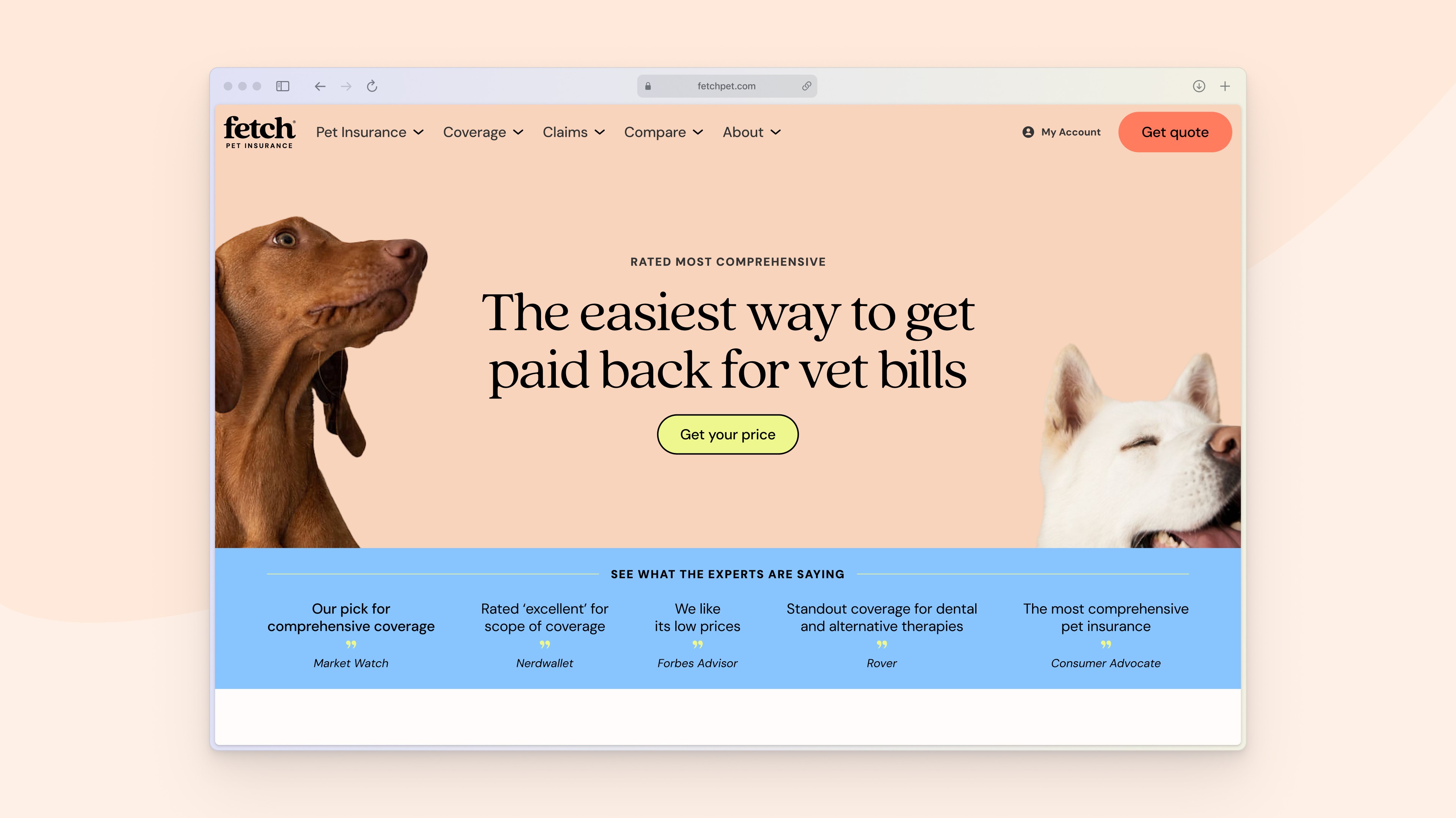
After some exploration, I came up a direction that was fresh, playful and bright. I chose to replace the original primary colors teal and pink with blue and peach, while adding lime and coral as accent colors. I updated Quincy to a lighter weight and introduced DM Sans in an all-caps text element to complement the serif headlines. Illustrations and icons were updated to have smoother edges and rounder lines. While brand photography included more pet-owner moments in bright, high-contrast settings.
Through user surveys and interviews, users described this direction as "more approachable" and "feels more like care". The bright colors and imagery direction increased emotional warmth and relatability.