Jiminy
Supporting mental health with friends and AI.
Product Design
Overview
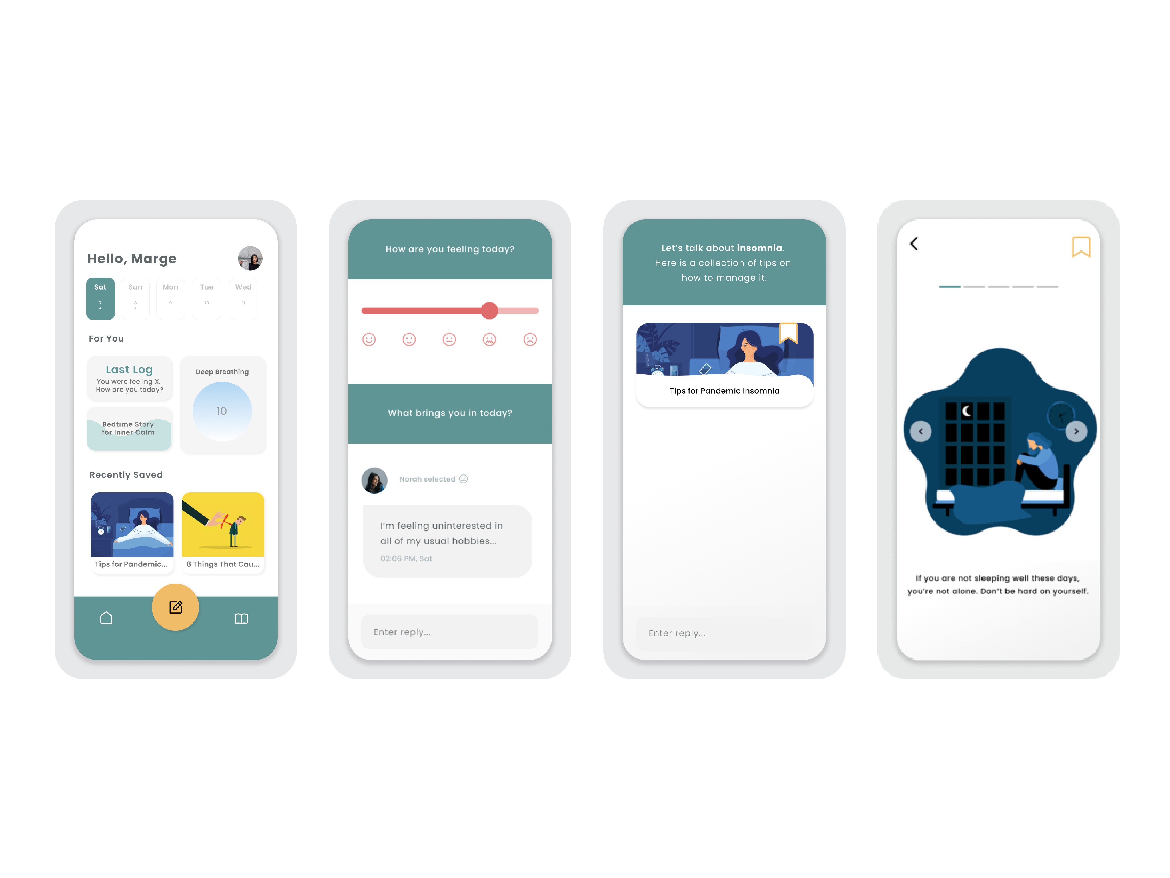
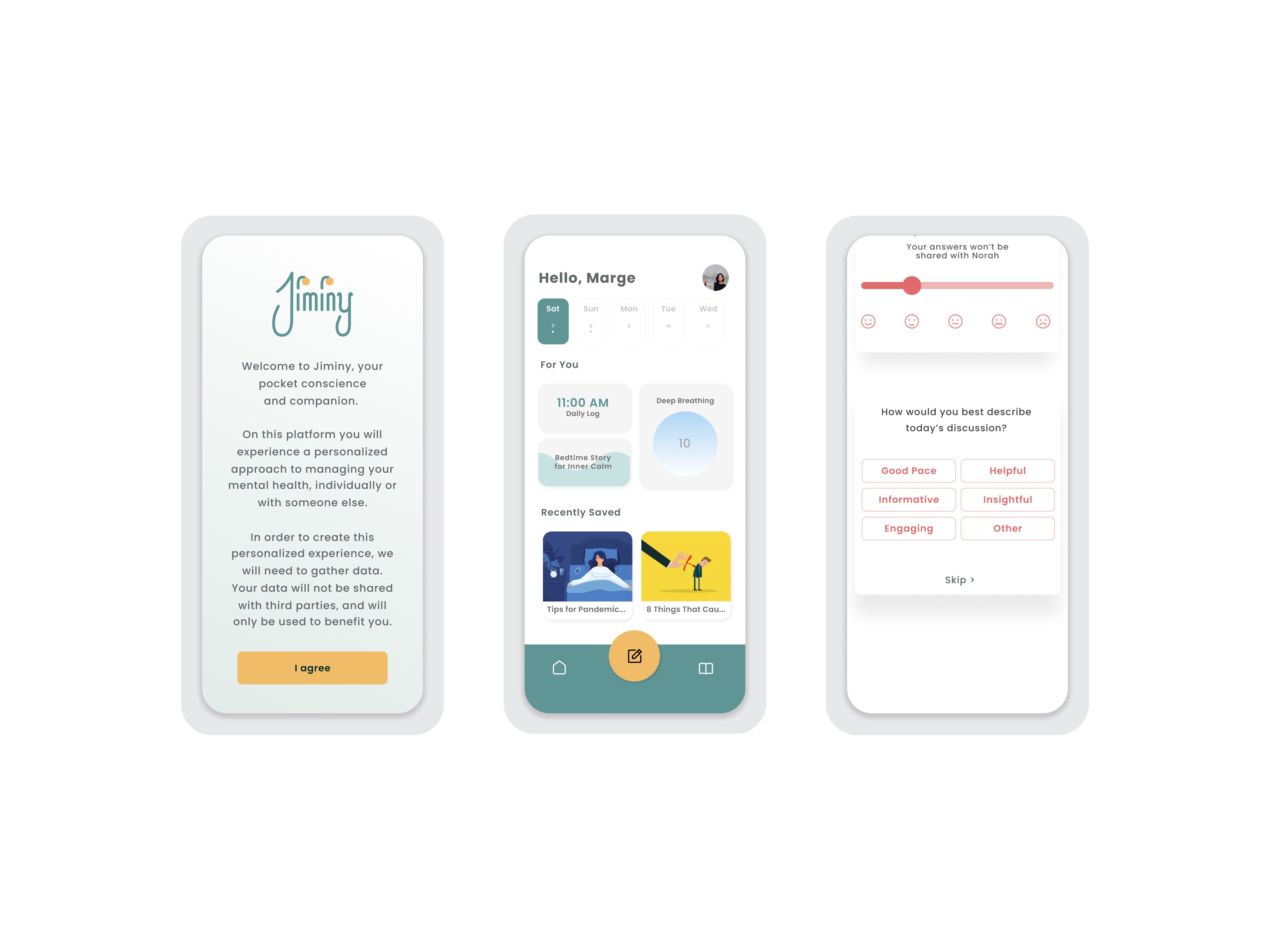
Jiminy, a mental health app that pairs users with a trusted friend and AI-guided support to help young people manage their well-being outside of traditional therapy.
Challenge
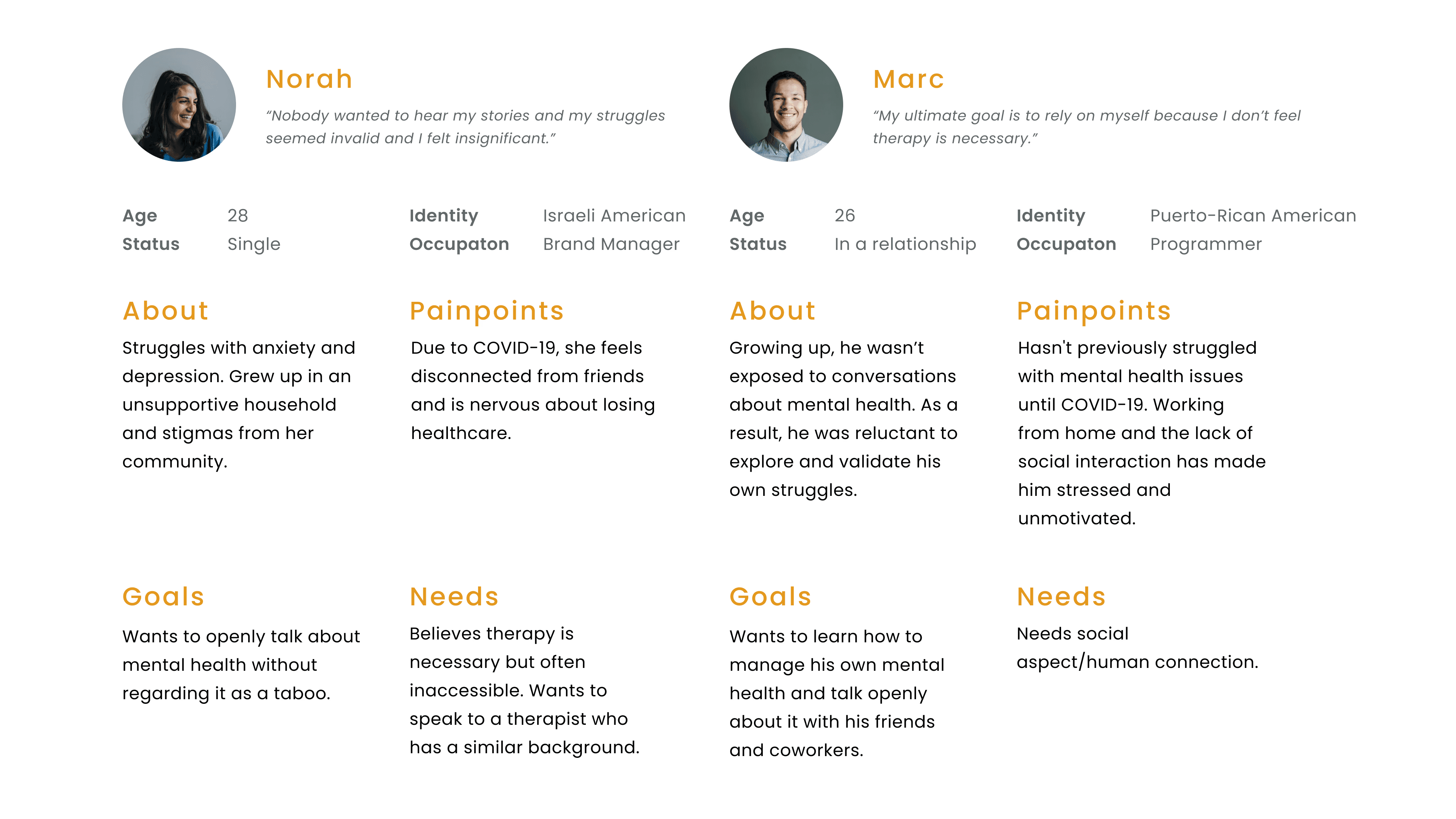
My teammates and I set out to address a problem we saw growing during the COVID-19 pandemic: a lack of accessible mental health resources, particularly for young people of color and those in marginalized groups.
We interviewed seven participants between the ages of 25 and 30 to understand how the pandemic had impacted their mental health, what resources they found helpful, and how their socio-economic identity affected their access to care. A key insight from our research was that traditional therapy was often seen as unhelpful, which led us to pivot toward a model focused on personal mental health management paired with social support.
Role
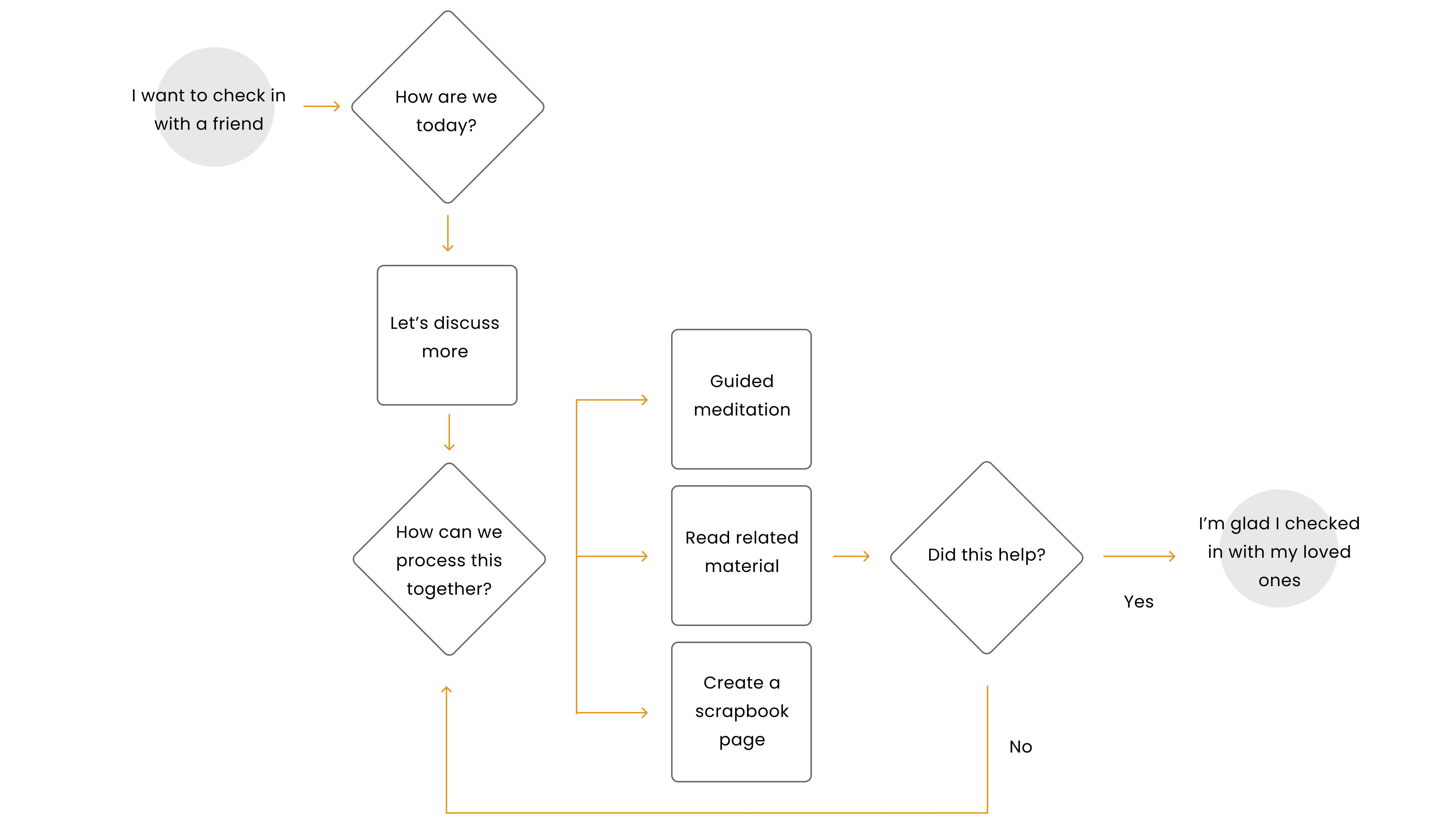
We moved into ideation, brainstorming features that would bring users together in a meaningful way. I proposed having users engage with someone they already trust so they could approach their mental wellness with a familiar ally rather than a stranger. I was also responsible for developing wireframes, proposing an existing design system and the interaction design.
Solution
We explored AI capabilities early on and – finding that supporting two users simultaneously wasn't feasible – developed an algorithmic approach where users select inputs to receive tailored results, alongside a two-person-plus-moderator conversation format.
We prototyped and tested with real users, uncovering pain points like confusing call-to-action buttons and an unintuitive emotional scale, which we iterated on throughout the process. Our next steps include building out an individual check-in flow, an onboarding guide, and key archive screens to round out the full experience.