Novi logo refresh
Updating Meta's fintech product's brand systems and go-to-market initiatives.
Brand Systems

Overview
Novi was an innovative fintech product, that enabled seamless money transfers across Meta's communication platforms. A logo refresh was needed after the original cryptocurrency partner separated with the product.
Challenge
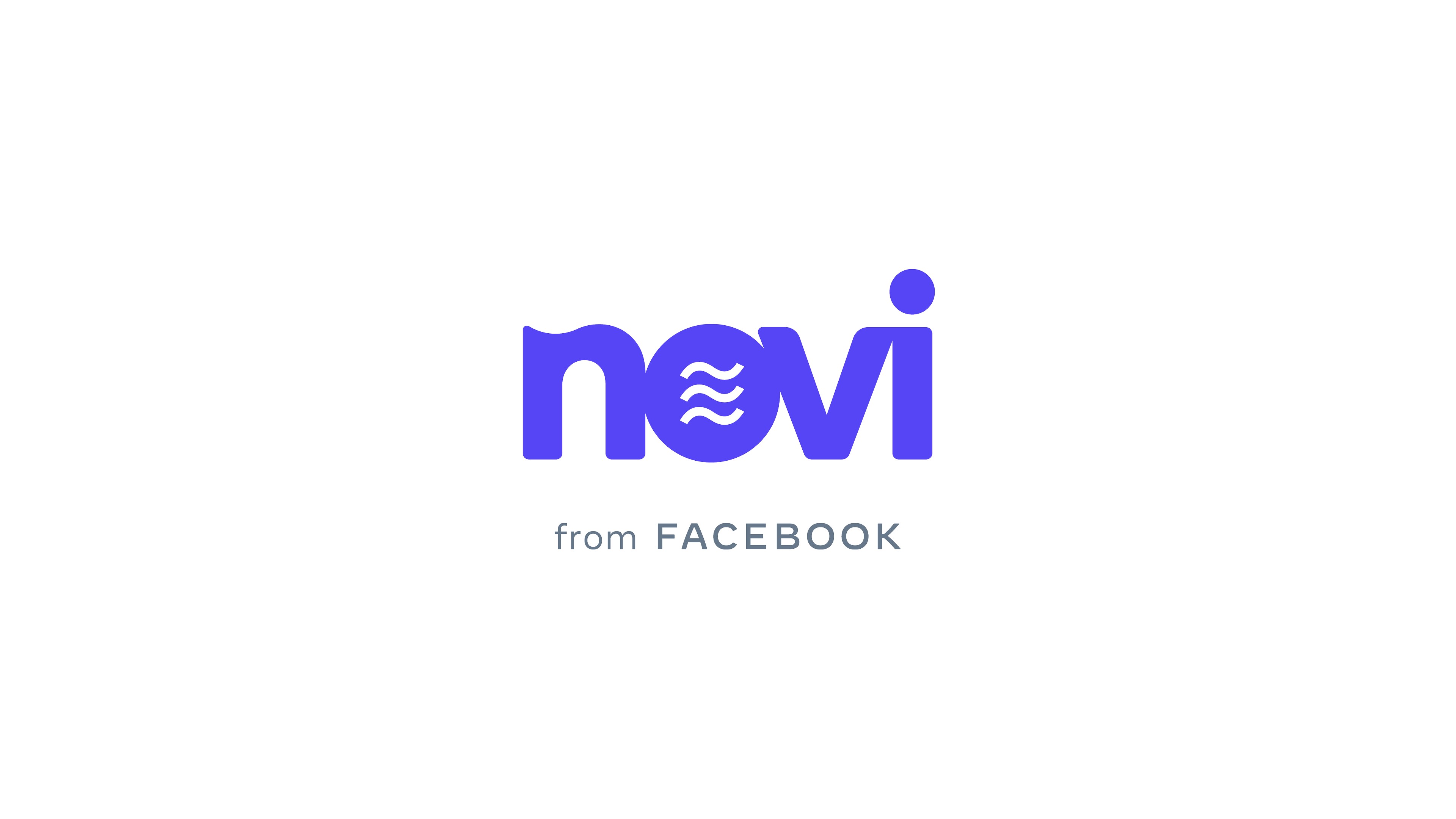
The logo needed a refresh after Diem was no longer used as Novi’s primary currency. The Diem wave symbol was strongly encapsulated in the original logo. The ask was to evolve the Novi logo to reflect the brand’s ambition of “making money work better for everyone everywhere.”
Role
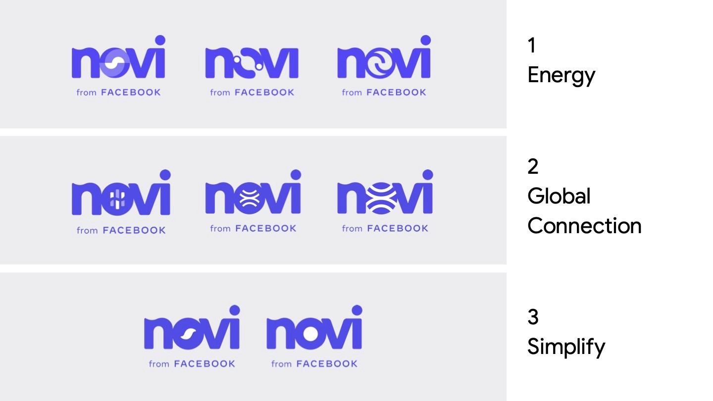
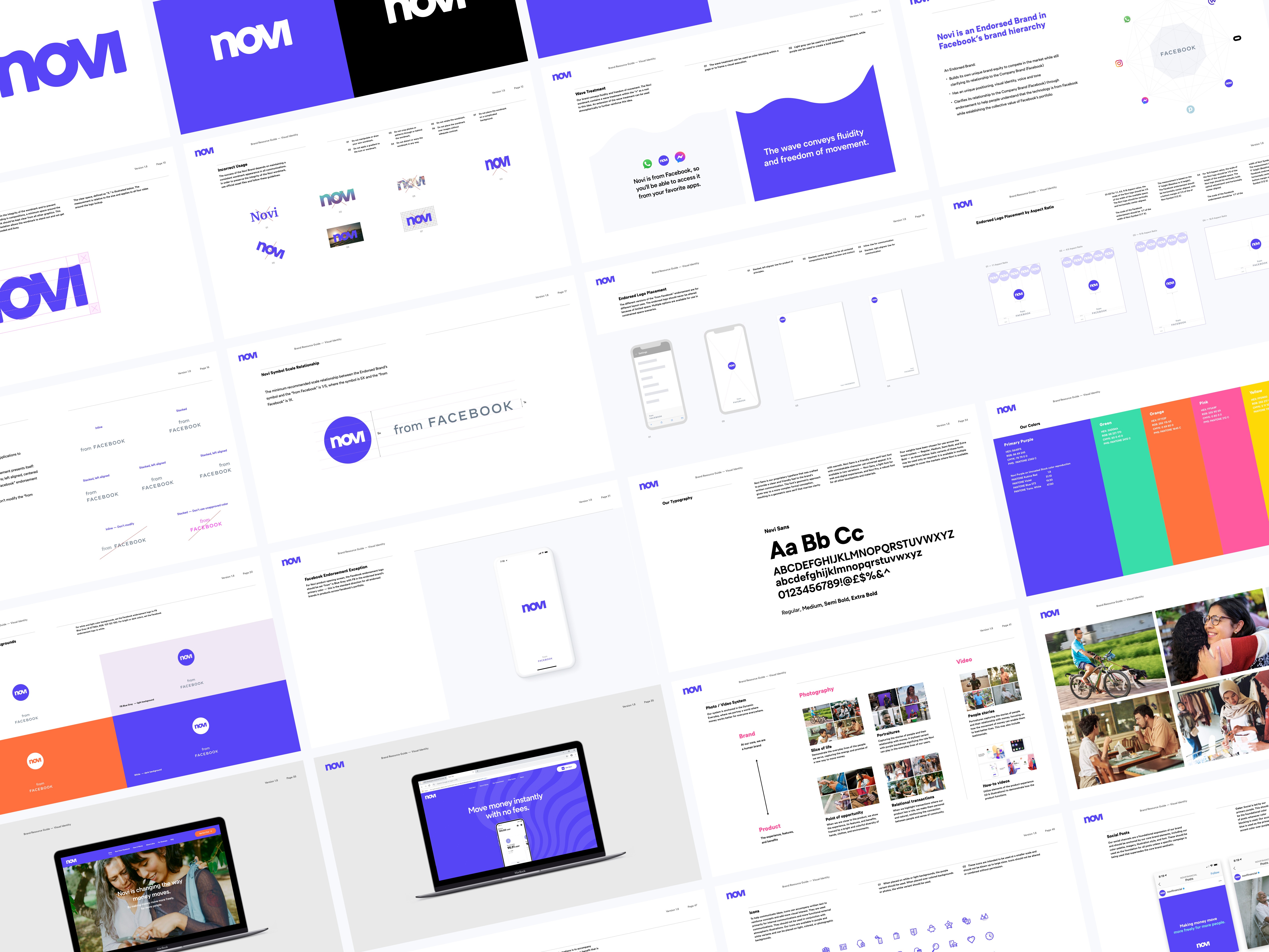
We collaborated with AKQA to establish criteria for evaluation. We also explored the following three territories: energy, global connection and simplify. I was responsible for updating the brand guidelines and go-to-market deliverables to reflect these changes.
Solution
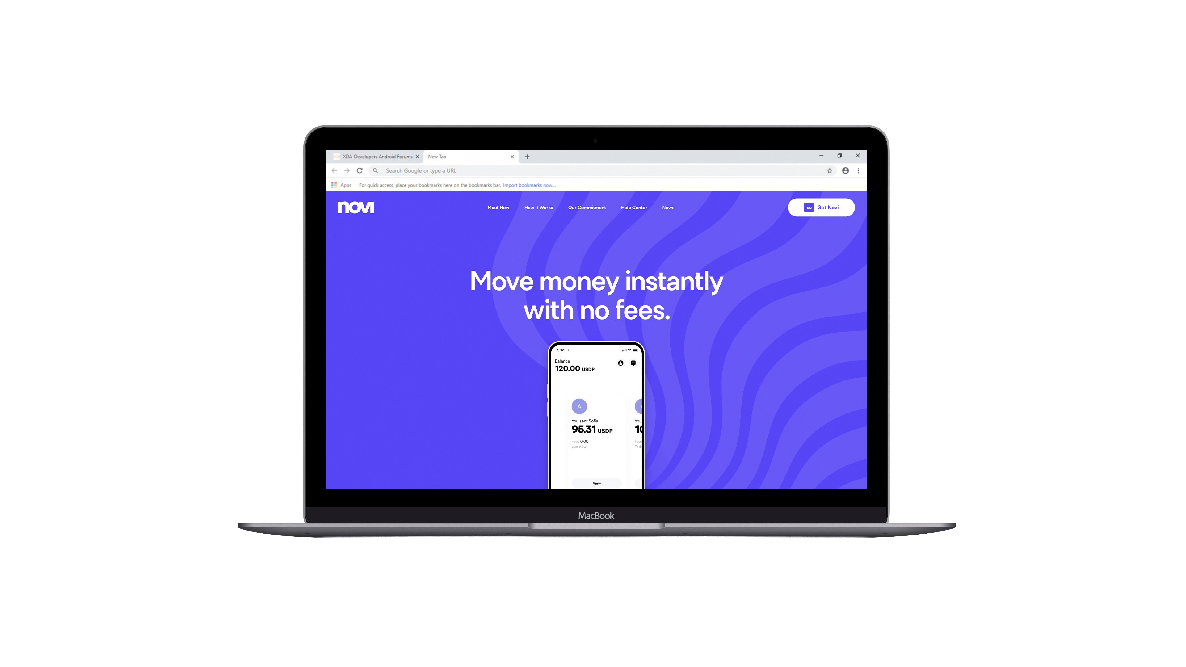
After much deliberation, the team decided to simplify the Novi logo, while retaining the wave as a visual element across its brand. It was important to keep the ambition of “making money work better for everyone everywhere” as the brand's mission.
In the end, Novi was not launched and sunsetted.